Why your website is your best salesperson

With more and more aspects of our lives going online, it’s no surprise that digital advertising has overtaken TV advertising with a $30 billion larger market. Hopeful for return on investment (ROI), businesses are joining this digital marketing spend frenzy in droves.
Content marketing, social media marketing, video marketing and email marketing are just a few digital options for small business owners. With so many inbound and outbound avenues, opportunities are widespread.
However, without a good website, many fall into a money-draining trap and don’t make the most of their dollars. Blindly pouring your marketing budget into the digital marketing mix without first optimising your website is like pouring water into a leaky bucket. Your company’s budget is a precious resource; you don’t want it to spill and go to waste.
How sales get lost at the website stage
Small business owners spend a lot on marketing but don’t always get the results they expect. So how does this cycle continue?
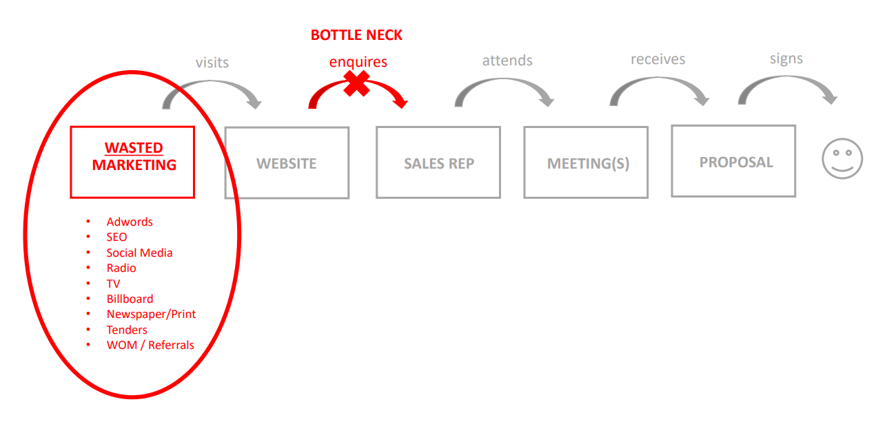
Not only are we stopping the flow of leads and sales but we're wasting significant and expensive marketing.
What many don’t realise is that the bottleneck that hinders great sales success and conversion sits at the website stage of the sales funnel process. If customers are dissatisfied with your website, they are unlikely to call your phone number, meet your sales reps or hear your proposal.
Without a good website, not only do we stop the flow of leads and sales, but we waste significant and expensive marketing funds. So you continue to spend on marketing, waste money and don’t see any real improvement.
Marketing spend increases traffic and attracts more potential customers to your website. Whether it’s from social media ads or email campaigns, your site visitors have arrived at the same destination. But once they get there, are they encouraged to explore or are they looking for the exit sign?
If your website is shabby, out of date or confusing to navigate, this poor user experience will decrease your chances of conversion. Unimpressed, users will bounce off and leave. In fact, 88% of online consumers are a lot less likely to return after a bad experience, so you also lose future sales opportunities.
How to measure the success of your website
Your website is the face of your business so it’s important to have a website that mirrors your offerings. If your website looks cheap, it will give new visitors that your business and products are low quality too.
If your website looks cheap, it will give new visitors the impression that your business and products are low quality. 57% of internet users say they won’t recommend a business with a poorly designed website. And why should they settle? With one click of the back button, your business is quickly forgotten as they dive into your competitor’s website.
But how do you know if your website is losing you potential customers?
Use your judgement
Here’s a simple test you can do to see if your website matches your business:
- Rate your business out of 10 on your products, service and professionalism.
- Set that score aside and rate your website out of 10, based on its visual appeal and ease of usability. Be as unbiased as possible.
- Step out of the CEO shoes and picture yourself as your target audience, envisage their pain points or questions. Repeat steps 1 and 2.
Are your scores the same?
If not, it’s crucial that you fix your website first and optimise its conversion potential before you crank up the traffic. The same way order matters when you follow a recipe, order matters in digital too.
Analyse the data
That’s a great test to do based on your gut instinct and intuition but we also recommend you pair this method with a numbers-based check. These numbers can correlate to how many users come through organically each month, which landing pages they interact with the most and how far they get down the page.
Seeing the numbers can give you a baseline to measure your improvements against, and really allow you to see the value in the changes you make. Google Analytics tracks a lot of data, which may be overwhelming at first.
Here are a few variables we’d recommend you start with:
Google Analytics Page views can show you which pages are most popular and how people flow through your website. A page with low views can indicate that there’s a roadblock from a connecting page or that your user journey needs to be simplified.
Google Analytics Bounce Rate can be a good indicator of which pages perform well and which pages need some improvement. When a user lands on your website, and then exits without clicking through to another page, that is recorded as a bounce.
A sure-fire way to improve your bounce rate is to make your website run faster. Deloitte Digital found that a 0.1 second decrease in load time can significantly improve a website’s overall performance with:
- 8% to 10% more conversions
- 10% more money spent on the average order
- 7% to 8% more pages viewed
- 5% improvement in product page bounce rates
- 5% increase in eCommerce customer engagement
Google Analytics Device Usage can help you understand the habits of your target audience. If your conversion rate optimisation (CRO) budget is small, you’ll want to know if you should prioritise improving your desktop experience or your mobile experience. It’s not just the question of snake person versus baby boomer anymore. Different industries and different products will lean on vastly different user experiences regardless of age.
What makes a good website
Your website is the engine that can drive your business. Once you’ve optimised it and it runs smoothly, you might even find that you need to spend less on spare parts and expensive petrol to meet your business goals.
Most companies only spend $1 on conversion rate optimisation for every $92 they spend on customer acquisition. But doesn’t it make more sense the other way around? In fact, the top converting companies spend at least 5% of their budget on CRO.
So, what makes a good website optimised for conversion?
A well-designed and conversion-optimised website depends on:
- a well-structured sitemap
- thoughtful UI/UX considerations for a clear user journey
- personable and persuasive copy
- good content design to break up copy so it’s digestible
- contact details that are easy to access at all times on site
- fast-loading pages, image assets and videos
- a responsive design that works across all devices.
Aside from helping to increase the return on your marketing spend, your website can be your best salesperson, your online service concierge, your product catalogue and your brand confidence check. Fulfilling so many responsibilities all at once is not an easy and straightforward task. When in doubt, team up with an experienced web designer or developer to help steer your optimisation efforts in the right direction.
However, there are some things you can do today to help your conversion.
Improve your conversion rate with shorter forms
An example of CRO in action is case study Imagescape, which saw a whopping 160% increase in form submissions. What did they do? They simply decreased their form fields from 11 to 4. Simplifying a lengthy check-out process made it more user-friendly and reduced the hurdles, especially to those who are time-poor or on the fence.
While we don’t deny the power of digital marketing, we can’t stress enough to get the order right. Fix the leaky bucket and ensure your website is geared to convert visitors into customers first.
Improve the legibility of your content with thoughtful content design
There’s no point spending lots on a copywriter if no one reads your content. Nowadays, users have an average attention span of 13 seconds, with a study showing that 69% of website content is never seen by visitors. It’s your job to make your website copy more digestible and scannable for your users, especially those who might be time-poor or on the go.
Design is not just restricted to your imagery; content design is just as important too. With better-looking content, you increase the chance that your message is understood. The Nielsen Norman Group found that 70% of people read through content if there are clear bullet points, compared to 55% who look at lists without bullet points.
With shorter paragraphs, subheadings and well-placed bullet points, you enable users to skim through your content quicker and anchor their scroll to the content that is relevant to them.
Ensure your contact details are easily accessible
Two statistics to highlight the importance of this.
- 44% of users will stop engaging with a website that doesn’t provide the company’s contact information.
- From the analysis of 100,000 page views, Clicktale found that only 22% of users scrolled all the way to the bottom.
Contact details are a source of credibility and trust for web users unfamiliar with your company and hard-to-find information greatly decreases the chance that users will call or book. If your contact information is sitting at the end of a long page of content, your users might miss it altogether.
A great way to tackle this is to consider a persistent navigation bar or a ‘Contact us’ link that sits in your primary navigation. Most users expect this so will remove any potential hurdle of how to reach out to your team.
Great conversion is just around the corner
High conversion at the website level looks like more engaged leads completing your booking form, more direct calls to your sales teams, more successful check-outs and higher organic rankings on the Google search results page.
With your website running at its full potential, the additional marketing dollars you spend are better set up to turn traffic into profit!